Pinball Publishing

Through the ever talented Kate Bingaman-Burt of Obsessive Consumption I found Pinball Publishing in Portland, Oregon. I have no need for a current print run, and like to do work locally, but they are so flippin' cool it might be worth the long distance to work with them on a future project. They recntly published a series of designer postcards which help promote their own mad printing skills. This one is by artist Lisa DeJohn. I'm obsessed with the rounded corners and it appears that Pinball is more than equipped to execute such details.

From Pinball: Lisa DeJohn is a fine artist, illustrator and surface designer living in the North Shore of Massachusetts. She draws inspiration from plant forms, animals, architectural structures and antique paper goods. Her freelance work includes clients such as Chronicle Books, The Land of Nod, teNeues Publishing, IKEA, Godiva Chocolatier and Urban Outfitters.

Kitchen Inspiration

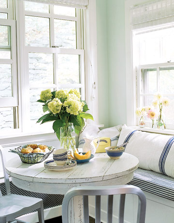
I'm in a SLOW process of updating our awesome 80s tract home kitchen. Starting with the creation of a breakfast nook. There is an awkward open space just calling for a cozy corner, and my dad and husband are graciously taking this project on. It's just the tip of the iceberg, though as I can't stand the dated and flaking tile countertops and wood cabinets. The kitchen is the darkest room in the house and has the lowest ceilings. It needs a light injection. I discovered a host of kitchen shots that feature bright white floors, which would solve the dark issue. Uugh. My floors are wood, but a bit over done. A little on the orange side I would say...Do I counteract that with white cabinets or go bold and paint everything dark? Oh, and I HAVE to have that red Brady lovin' phone.

{All images courtesy: Domino and Country Living}

Looky Loo

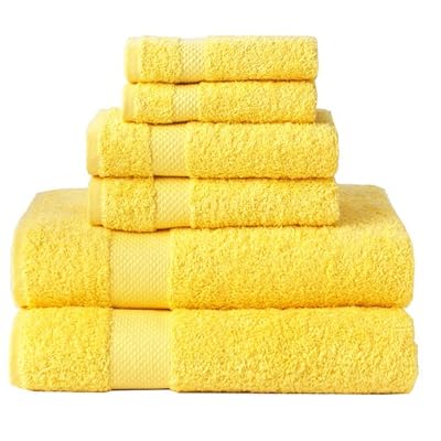
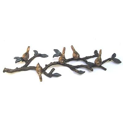
This is our main bath, the loo, on 80's track home fever. On New Year's Day I finally had it with the cheap towel rack, old woodwork, and dirty off white paint job. I went to the garage and discovered some amazing unopened Behr exterior semi-gloss in Bitter Chocolate. Excellent choice! Why do I have this? Hmmm. The other color I had waiting in the wings was a beautiful bubble yum pink, originally intended for my office. Ummm. No. Best wait on this one. So I trucked on over to Home Depot and found Creek Bend. Nice....the bathroom is looking so ritzy now! To complete the look I must incorporate an element of whimsy and grapic fun. I found this fabulous Marimekko shower curtain at Crate & Barrel, towels at Target (in "sunshine"), and I'm still debating on the towel hooks--while I appreciate the homage to the Amish, the birds might be nice if I spray painted them dark brown...

ReForm School

In my quest for a red Keep Calm and Carry On original screen print I found the most excellent website, ReForm School. I heart their aesthetic and found these very original cards made by Polite Cards with Bob and Roberta Smith. ReForm School has the most fabulous "categories" such as Home Ec, Child Development, Locker Room, and my favorite-- Student of the Month which features an artist. LOVE the opportunities here for original, affordable art. Quirky, fresh, and lovely. Very Wes Anderson. They have a brick and mortar shop in LA, and I'll be sure to visit the next time I head north.

Happiness is...

Happiness is...Coffee, Best Friends, Responsible Ecological Choices, and Great Design

I had the pleasure of spending great BFF time with KT in Minneapolis last weekend. While my original gift idea was to locate a quality version of the old "Best Friends" necklace, with the charm split in two, we found something better. In our shopping excursions we located a sophisticated, yet utilitarian item already on my holiday wish/give list:

I Am Not A Paper Cup James Burgess, 2007 An eco-friendly alternative to disposable cups, this double-walled porcelain version with a pliable silicone lid keeps beverages hot and doesn't burn your hand. Found in a variety of locations--momastore.org, thinkgeek.com--we found these at Paper Source in Uptown Minneapolis. I heart mine.

She's Crafty

I just returned from snow town--Minneapolis--where I spent a glorious 2.5 days in the company of friends, family, art and good food. I had the distinct pleasure of showing my Truly Fine wares at The Gale Mansion with other artists whose work I've grown up admiring. I also spent some quality BFF time shopping at Patina and Paper Source, and dining at Lucia's. The surprise hit of my weekend followed the Gale show, at the VFW in Uptown. "The Handmaiden's Present: Craftsmas" featured rockin' indie crafters with quirky humor and perky presentations. I'm so thrilled to have met Detroit's Queen Craftin' Bee, Stephanie of Phantom Limb and the Handmade Detroit collective. She introduced me to another cool chick, Angela, a co-founder of I Like You, a Minneapolis brick & morter featuring local artists. Our weekend culminated with great conversation and burgers at Bryant Lake Bowl, an MSP institution.

Blue

I try to keep this "professional" and interesting devoid of tabloid style commentary. We'll see. Today i'm writing about my favorite color, BLUE. i love blue as a word too. I used to have a T-shirt that had BLUE written in all different languages. Beautiful as kek, bleu, or azzuro. I really am into the Morrocan rich blue that is featured in the recent issue of Elle Decor. Fabrics, pottery and tile. The gardens of Yves Saint Laurent's compound in Marakesh are so gorgeous and SO rich in color. I love it. I told Jarrod we should go there. We'll see.

Unstoppable Nate Berkus

So ONE more thing! In this issue of Elle Decor (Sept 08), they feature the unstoppable Nate Berkus. My best gal pals and I have been watching Nate's rise to fame via Oprah because we went to Hopkins High School in Minnetonka, MN with Mr. Berkus. We even shared home room, back when he rocked a pink polo shirt, collar up, layered with another preppy find. Cute then, cute now. Congratulations Nate!

Inspired by Art


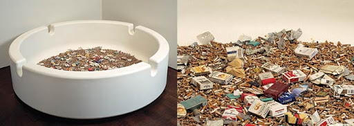
After a lovely trek to Boulder I'm back to the summer grind in sunny San Diego. Going to work after fun, family AND whitewater rafting is so so hard! I confess, i fell in love with the Denver Art museum, and did not once experience vertigo in their funked up space. Damien Hirst's ginormous ash tray, entitled Party Time, was a major highlight. It's large and filthy, but for some reason i loved it. I also was drawn to works on paper in a small exhibition assembled by printmaker Melanie Yazzie, Associate Professor of Art at the University of Colorado, Boulder. Really wonderful works, that i wish i could begin to acquire. Finally--new designer favorite: Johnny Was. Gorgeous material and colors. SOO cheery & fresh.

Back from Sabbatical

Dear Diary, I'm taking this quiet moment sans children, husband still in bed, to get back on blog track. It's so easy to let the daily grind take over my creative space-physically and mentally. I finally cleared a path in my office, and made room on my desk for a laptop. Forget that though...I'm drinking hot java, looking through a window with a view--hummingbirds, bunnies and a roadrunner are my friends today. Amy Winehouse and Rilo Kiley also keep me company. I love RK's "Under the Blacklight" album which i recently downloaded. a bit of country, pop and indie. Just right. Latest accomplishments: #1. I mastered the Mojito--pitcher style. While I pretty much cashed out my supply of fresh mint (found growing on the side of the house, SCORE!), I think it was well worth it. #2. Jarrod deconstructed our 80's style patio "gazebo" so that i will be able to turn into a chic cabana. Curtains arrive tomorrow. I'm getting garden inspired for our backyard redux, and I'm also scheming a facelift for the main bath. Marimekko shower curtain? Needs to be bold. COLOR. Yellow. So solstice-y....Cheers!

My Favorite Things: In the Office


I've decided it would be fun to write about some of my favorite things--the themes i can cover are endless, and maybe it will help me keep on blog task! So to begin...I'm admittedly TYPE A when i comes to my supplies at work (home & museum). I might even compare myself to Milton and his red stapler in cult classic Office Space. {Note to all: PLEASE see this film. I guarantee, you are not sporting enough flair.} I've gone so far as to label my No. 8 Orange Fiskars, as well as my stapler and my wooden 18" ruler. The Fiskars must not be replaced by a cheap imitation. It simply won't do. I've added to my home office the Fiskars Titanium Nitride 9.5 In. Shop Shears which hang gleefully on my pegboard next to double-sided Scotch tape (i heart 3M) and an ancient pair of pinking shears. Speaking of labeling. My office would not be complete without the Brother P-touch 1750. I believe the latest version of this model is 1950. When a labeler is not necessary, Mr. Sharpie comes to the rescue. I'm especially fond of the retractable fine points for general usage, and the extra fine points for writing notes. Sharpie ALSO now offers highlighters (amazing) and you can personalize your pens with name, monogram, message or pirate clip art. Ahoy matey!